

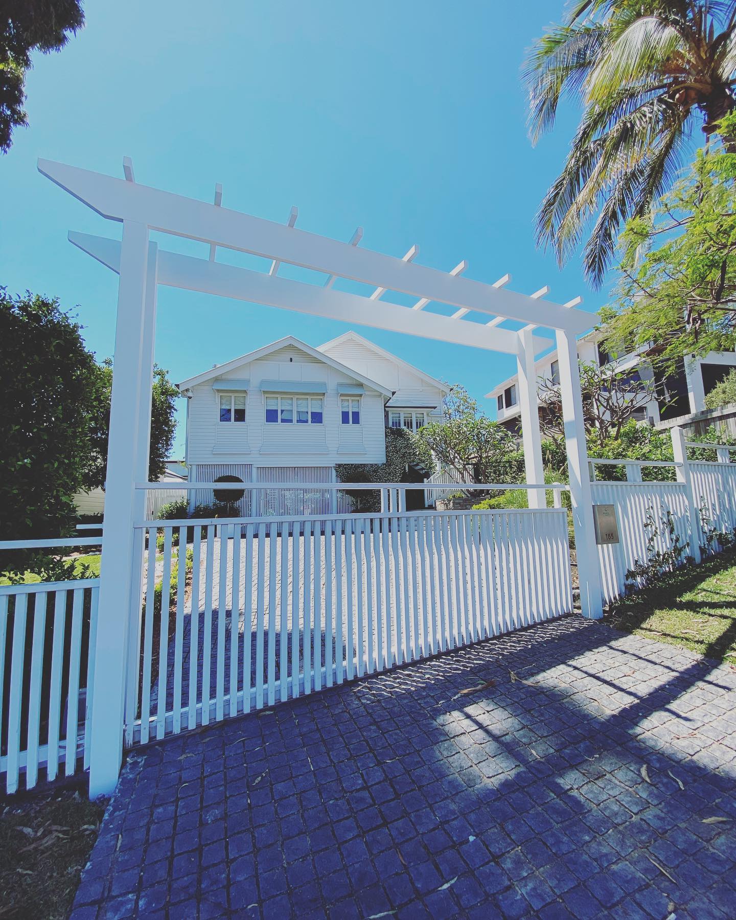
Few homes are as instantly recognisable as the Queenslander. Raised on timber or steel stumps, wrapped in wide verandas, finished with decorative fretwork and steeply pitched roofs, these homes were designed generations ago to handle Queensland’s heat long before air conditioning existed.
That same design is exactly why choosing paint colours for a Queenslander is trickier than picking colours for a standard brick home. Get it right and the architecture sings. Get it wrong and a beautiful old home can end up looking flat, or worse, like it’s wearing someone else’s outfit.
If you’re staring down a repaint and not sure where to start, here’s how to think about colour on a Queenslander in a way that respects what makes it special.
The Traditional Three Part Colour Formula
Most Queenslander colour schemes, whether heritage or contemporary, work off the same basic structure: a body colour, a trim colour, and an accent colour. The body colour covers the main weatherboards or cladding and sets the overall tone of the house. The trim colour picks out window frames, fascias, balustrades and stumps, and is what gives the home its lines and definition. The accent colour, often used more sparingly, highlights the decorative details Queenslanders are known for, things like fretwork, finials, window canopies and gable ends.
This three part approach isn’t a rigid rule, but it’s a genuinely useful way to plan a scheme, because it forces you to think about the architecture piece by piece rather than picking one colour and hoping it works everywhere.
Traditional Palettes vs Contemporary Reinterpretations
If you want to keep things classic, the traditional Queenslander palette leans on muted greys, soft biscuits, warm creams and off whites, often finished with crisp white trim to highlight the timber detailing. These tones were originally chosen because they suited the materials available and the heat, and they’ve stood the test of time because they let the architecture do the talking rather than competing with it.
If you’re after something with a bit more personality, there’s plenty of room to move without losing the character of the home. A darker, more grounded palette, charcoal, deep blue or even black trims paired with a lighter body, can give a Queenslander a more contemporary, considered look. Earthy tones inspired by the surrounding garden work well for homes tucked into greenery, while cooler, lighter palettes suit Queenslanders closer to the coast. The key with any bolder direction is restraint. One strong colour used well on trims or a feature element usually looks better than several competing bold colours across the whole house.
What Actually Changes the Right Answer
There’s no single correct colour scheme for every Queenslander, because the right answer depends on a handful of practical factors.
Material. Timber weatherboards, VJ (vertical joint) panelling, and fibro cladding all take colour differently, and older timber in particular often needs proper preparation before a colour choice even matters.
Stumps. Whether your Queenslander sits high on exposed timber or steel stumps, or has been built in underneath, changes how much of the trim colour is actually visible and how much weight that colour carries in the overall look.
Heritage or character area rules. If your home sits within one of Brisbane’s character residential precincts or is heritage listed, there may be restrictions on exterior colours, particularly for street facing elevations. It’s worth checking with Brisbane City Council(or a planner if you know one) before locking in anything unusual, since this can affect what’s actually allowed, not just what looks good.
Light and orientation. A colour that looks soft and neutral on a north facing veranda can read very differently on a shaded southern side of the same house. Testing colours in the actual light of your home, at different times of day, matters more with Queenslanders than most other home styles because of how much veranda and shade is involved.
Common Mistakes Worth Avoiding
A few mistakes come up again and again on Queenslanders. Going too dark on a smaller home can make it feel heavier and smaller than it is, rather than more sophisticated. Painting fretwork and detailing the same colour as the body erases exactly the kind of character that makes a Queenslander worth preserving in the first place. And choosing a trend led colour scheme without considering the home’s actual materials or heritage context can date quickly, or clash with the timber and roofline underneath.
The safest approach is usually to let the architecture lead. Queenslanders already have strong lines, proportion and detail built in. Colour should highlight that, not fight against it.
Getting the Colour Consultation Right
This is exactly the kind of decision where a second opinion earns its keep. At Trade Painters, our colour consultations take into account your home’s natural lighting, its materials, and its overall style before recommending a palette, and we can arrange viewings of finished projects so you can see how different schemes actually look on a Queenslander in real life, not just on a colour swatch. Being Dulux accredited also means the palette you choose is backed by paint built to handle Queensland’s climate over the long run, not just look good on the day it’s finished.
Repainting a Queenslander is one of the few home improvement jobs that can genuinely change how a house feels to live in and look at from the street. Taking the time to get the colours right, rather than rushing the decision, is what separates a good repaint from a great one.